To Our Partners and Friends,
Appreciate your support over the past 30 years. As YG marks its 30th anniversary in 2025, we’ll launch a new logo on October 1, 2025, to better convey our core values and boost global competitiveness. This isn’t just a visual update, but a statement of our evolution from an experience-driven entity to a tech-powered brand.
The Meaning of YG’s New Logo
Logo is the visual embodiment of the brand spirit. The new logo of YG presents the growth trajectory, core value, and strategic direction of the brand through intuitive visual elements. Each part of the design carries the enterprise’s philosophy and positioning. The following is an interpretation of the brand story behind the new Logo for you:
1. Modern Take on a Classic Core
The new logo keeps “Y” and “G” as its centerpiece, with bolded typography. Its solid lines carry 30 years of brand heritage while enhancing visual impact to highlight our expertise as a long-standing industry partner.
2.Growth Symbol: The “Y” Tree
The “Y” is designed as an upward-growing tree, with rounded edges and a larger size than the previous version. It mirrors our 30-year journey – from a small sapling taking root in the industry, growing steadily through consistent progress, to a strong, established tree. YG has become a reliable partner capable of handling large-scale client projects, with every step of growth reflecting our shared journey.
3. Support and Empowerment: The “G” Arrow’s Dual Promise
The “G” takes the form of a sharp, semi-circular arrow with unrounded lines for precision and stability. It embodies our foundations and service approach: the soil-like outer curve represents our reliance on China’s stable supply chain to fuel collaborations; the arrow’s closed loop signifies a one-stop process from design and production to delivery, ensuring efficient, smooth cooperation.
4. Clear Brand Positioning: From “YG” to “YG TeCH”
The right side of the logo shortens “Yuan Guan” to “YG” and adds “TeCH”, creating “YG TeCH”. This isn’t just a name change, but a clear shift from a traditional service provider to a tech-driven product solutions provider.
5. People-Focused Tech Philosophy: The Meaning of Lowercase “e”
The lowercase “e” in “TeCH” is key to our brand philosophy. It stands for:
① explore: Using tech innovation to break design and manufacturing limits, delivering more competitive solutions.
② everyone: Full team involvement across design, production, and after-sales to ensure professional support at every stage.
③ easy: Simplified processes and optimized services to make cooperation with YG hassle-free for all clients.
④ efficient: One-stop service reduces communication costs for clients, boosting collaboration efficiency.
These align with our slogan “MAKE PEOPLE’S LIFE EASIER”, reflecting our commitment: using continuous tech innovation to expand industry possibilities, enabling everyone to enjoy simpler lives, and strengthening our mission of “Technology Serves People”.
The new logo sums up our 30-year journey and commits to the future. Every design element – from the growing tree to tech’s human touch – reflects our focus on quality, innovation, and commitment to partnering with you.
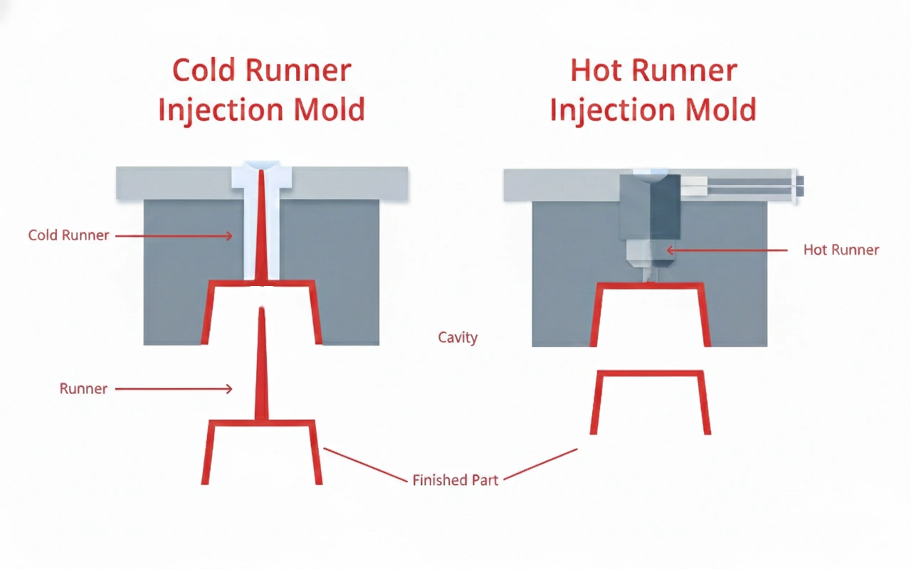
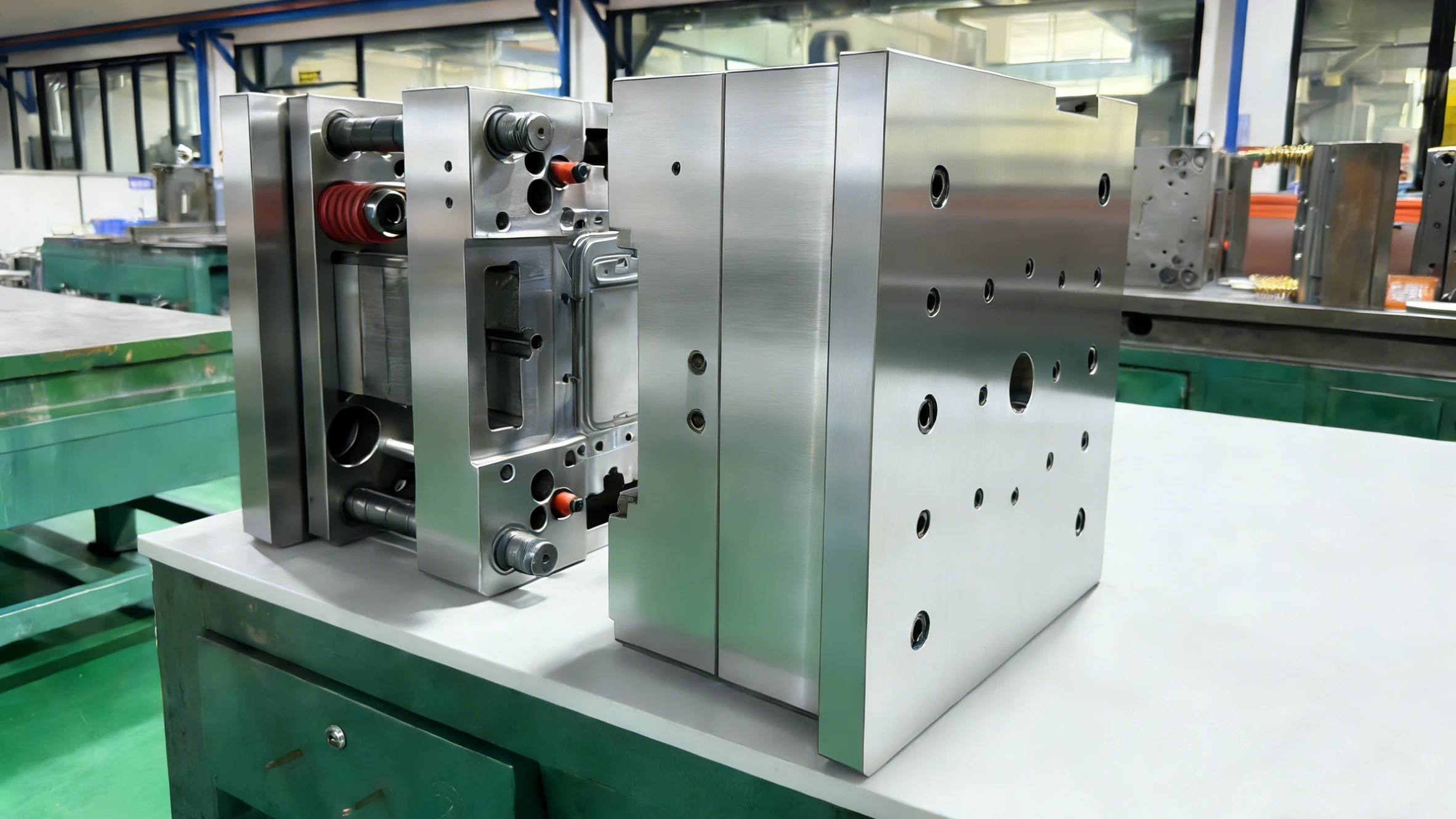
From Logo to Factory: We’ve Upgraded to Deliver on Our Promises
| Equipment Type | Core Capabilities | Your Direct Value |
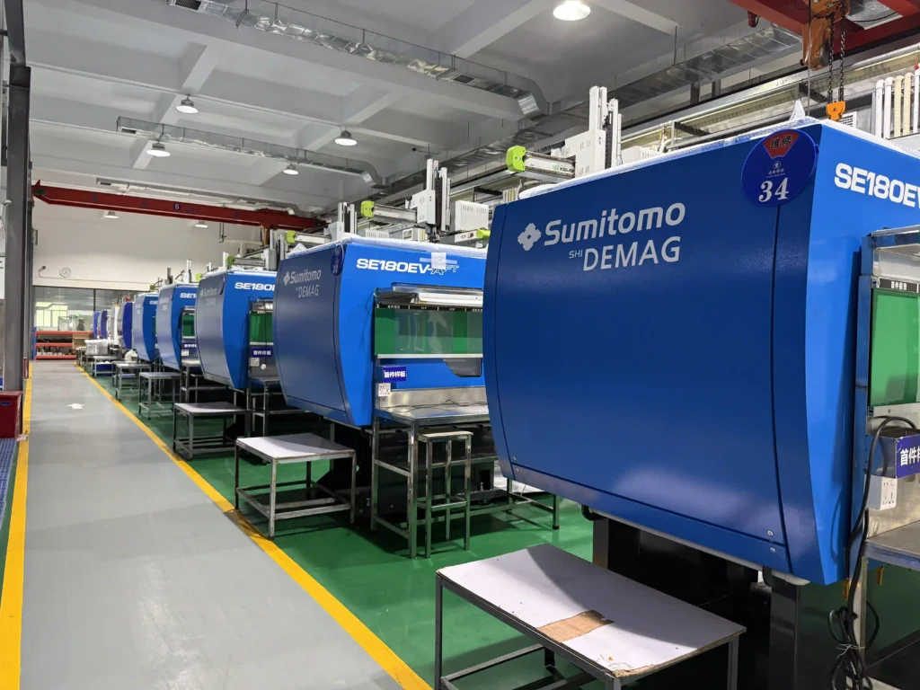
| Sumitomo SE-EV-S All-Electric Injection Molding Machines | ±0.01mm repeatability; 500–1,800 kN lock force; 50% lower energy use. | Zero-burr ultra-thin cases; fewer reworks; lower costs + stronger sustainability. |
| Haitian MA Series Injection Molding Machines | 12x160T + 2x200T; 8,000 cases/day (15% faster than industry avg). | Shorter lead times for tight deadlines; defect rates cut (e.g., 5%→0.8% for TPU). |
| Makino EDGE3i Sinker EDM | ±2μm accuracy; Ra ≤0.2μm surface finish; 40% less setup time. | Flawless micro-features (e.g., AirPod vents); unattended overnight operation. |
| Makino U3 5-Axis CNC Machines | ±1.5μm positioning accuracy; 20,000 RPM spindle; 30% longer tool life. | Complex designs (e.g., MagSafe) made in one setup; lower mold-making costs. |
These upgrades are not just about new machines – they are about how we fulfill the promise of the logo: fewer defects, faster delivery, and the freedom to turn your boldest designs into reality. Backed by ISO 13485 (medical grade) and ISO 14001 (environmental) certifications, you are collaborating with a technology-driven team that is as reliable as our 30-year tradition.
Welcome to Visit Our Factory
Words and trademarks are only part of the story, but do you see our new machine running? This is where miracles happen. We welcome you to our factory.
- Watch Sumitomo and Makino Machinery create precision cases right before your eyes
- Walk through our one-stop “design → production → delivery” process
- Talk to our team about how we can turn your custom design into reality
Wrapping Up: 30 Years, and We’re Just Getting Started
The new logo sums up our 30-year journey and commits to the future. Every design element – from the growing tree to tech’s human touch – reflects our focus on quality, innovation, and commitment to partnering with you.
Looking forward to growing with you in the next 30 years!
.webp)